
How to Use Color Psychology in Interior Design
Colors have a profound impact on how we feel, think, and interact with our surroundings. In interior design, understanding the psychology of colors can transform a space, setting the right tone for each room and enhancing its purpose. Whether you want to create a calm sanctuary, an energizing workspace, or a cozy living room, the right color palette is key. Let’s dive into how to use color psychology effectively in interior design. 🎨✨
Understanding Color Psychology
Each color carries a unique emotional and psychological influence. By understanding the meaning and impact of colors, you can align your interior design choices with the mood or atmosphere you want to create.
- Red ❤️: Red is bold, passionate, and energetic. It’s a great choice for dining rooms, as it stimulates conversation and appetite, but use it sparingly in bedrooms to avoid overstimulation.
- Blue 💙: Known for its calming and soothing effects, blue is ideal for bedrooms, bathrooms, and offices, promoting relaxation and focus.
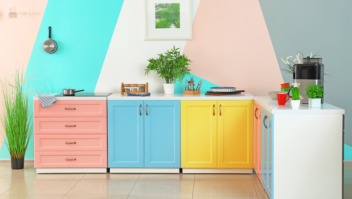
- Yellow 💛: Bright and cheerful, yellow brings warmth and positivity. It’s perfect for kitchens and living areas but should be used in moderation to avoid overwhelming the senses.
- Green 💚: Symbolizing nature and balance, green adds a refreshing and tranquil vibe. It works beautifully in almost any space, from living rooms to bedrooms.
- Purple 💜: Associated with luxury and creativity, purple adds a touch of sophistication. Use it in accents or feature walls to create drama and elegance.
- White 🤍: Clean, minimalist, and timeless, white opens up spaces and creates a sense of serenity. Pair it with textures or pops of color to avoid a sterile look.
- Black 🖤: Bold and dramatic, black can add depth and sophistication when used strategically, such as in furniture or accents.
How to Choose Colors for Each Room
- Living Room: Create a welcoming and comfortable atmosphere with warm, neutral tones like beige or taupe. Add color pops through cushions, rugs, or artwork to reflect your personality.
- Bedroom: Prioritize calm and relaxation with soft blues, greens, or lavender tones. Avoid overly vibrant colors that might disrupt sleep.
- Kitchen: Energize the space with yellows, oranges, or whites. These colors promote a sense of warmth and cleanliness.
- Bathroom: Opt for fresh, clean tones like aqua, teal, or soft gray to evoke a spa-like experience.
- Home Office: Boost focus and creativity with blues or greens. Add subtle accents of yellow or orange for energy without overwhelming the space.
Tips for Using Color Psychology in Your Home
- Start Small: If you’re unsure, introduce color through accents like pillows, rugs, or wall art before committing to larger changes.
- Balance is Key: Avoid using too many bold colors in one space. Combine neutrals with one or two standout shades for a balanced look.
- Consider Lighting: Natural and artificial lighting can change how colors appear. Test paint swatches in different lighting conditions before making a decision.
- Use Color Zones: For open-plan spaces, use different colors to define specific areas, like dining or lounging zones.
- Trust Your Intuition: While psychology provides a framework, ultimately, your home should feel personal and aligned with your preferences.
Leave a Reply